Visual Synthesis and Esthetic Values
Carla Farsi
Associate
Professor of Mathematics
Chair, 2005 CU
Special Year in Art and Mathematics http://math.colorado.edu/Art&Math/index.html
Department of
Mathematics
University of
Colorado/Boulder
Boulder CO
80301-0395, USA
farsi@euclid.colorado.edu http://spot.colorado.edu/~farsi/
Kristopher R.
Collins
Department of
Mathematics
University of
Colorado/Boulder
Boulder CO
80301-0395, USA
Kristopher.Collins@colorado.edu
http://www.digvisuals.com/genarts/
Abstract
As
primarily visual creatures, we are subject to enormous amounts of
sight-stimulus at all times. In nature
we see things that are regarded as "beautiful,” a flower, a sunset, a
mountain range. We also see things that
invoke a negative reaction, often one of fear or danger.
We
propose to create original software that will synthesize visual material. This material will be generated using
algorithms that will attempt to correlate certain mathematical functions with
visually pleasing results. We hope to
find characteristics of appealing visual material that can be quantified in
some way. Symmetry, color balance,
color harmonization, self-similarity, smoothness, negative space, sharpness and
complexity are only some of the apparently quantifiable areas which seem to
play a role in determining if an image is pleasing or not.
After
developing our program to allow for a huge range of output, a test will take
place. Images will be generated, and then rated by a panel of math
students. For each image, the students
will rate the visual appeal. From this
data we hope to find trends that show what kind of parameters generate good
results.
By
synthesizing images, we remove the element of objective familiarity; a flower
would presumably be rated as appealing, but would a stylistically similar
synthesized image receive the same rating?
A carefully implemented program will allow for each unique image to be based upon a savable string of data, or genotype (according to Karl Sims’s terminology). This project will attempt to collect a decent sized sample base of images, their genotypes, and their ratings.
I. Introduction
Like
other forms of visual art, computer art is subject to certain generalizations
or trends that correlate to the piece's appeal. In language, we have developed words such as "palette",
"shape", "composition" and many others to represent some
particular visual attribute of the image.
When we look at pieces of art, we know what we like, but it is not
always easy to describe why we like it.
Where does the appeal of Mona Lisa lie?
Does it come from her form, the colors, the history, the realism - or a
combination? Certainly all of these and
many more play a role in the appeal of such a painting.
The
advantage of computer graphics is that it now definitively supercedes all other
2 dimensional art forms in terms of "visual information". By this I mean that through the
technological advances of digital image quality, we can visually represent
anything flat in a high resolution, high depth RGB image. From photographs to drawings and paintings,
the digital version can be so detailed that we do not differentiate from the
original. Of course there are things
that get lost - texture, size, and environment, to start - but when asked to
identify the image on screen, there is still more than enough information to
immediately recognize Mona Lisa.
Not
only will the recognition get translated, but so will the appeal and feeling
derived from the visual aspects of the original. For this reason, it would follow that the RGB display is more
than sufficient canvas to examine core aspects of image appeal. Of course, the power (and the point) of
examining images in digital form is to quantify the visual information in some
way.
This
study, and the accompanying Mac OSX visual synthesis software (MOTH 3.0a) is an
attempt to isolate and quantify very basic elements of image appeal. By developing a system of image synthesis
that allows for a large variety of possible outcomes as well as a
quantification of its synthesis routines, we hope to find trends corresponding
to image appeal. Since the space of
possible images is so huge, a way is needed to quickly explore lots of
possibilities. Hence, the interface design was derived from looking at the
interfaces of analog audio synthesizers.
The
main advantage to the use of synthesized images as opposed to scans, or digital
photographs is that the generated material is a more pure visual specimen. By this I mean that for example many of the
concepts which make Mona Lisa appealing - subject (human face), realism (very
realistic), emotion (sad?), history -
are inherently missing from synthesized art.
Without these factors, we are able to better isolate the two things we
care most about: color (palette), and composition (how the array is filled).
We
will ignore the possible influence of the medium of the digital form
itself. Elements such as resolution,
artifacts, and incompleteness of the RGB color model, while possibly playing a
role in image appeal, are ignored. Of
course the digital image will never be anything but a compartmentalized symbol
of the true continuous sensory experience of "real art". As color depth and resolution approach
infinity, the eye is tricked but the original image is in some very valid sense
lost altogether. For this paper it is
assumed that a high-resolution scan of Mona Lisa on a 1:1 scale screen carries
the same visual information as the original.
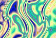
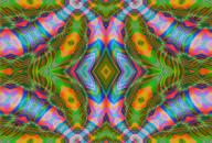
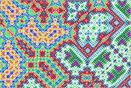
II. The software basics
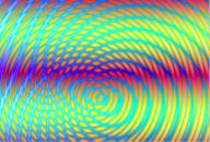
In
visual synthesis, the range of possibilities is immense. Imagine simply a 720x486x16bit VGA image
space. Its possible values could be
nearly anything. From a pure black field to Dali's "Persistence of
Memory”. Every frame from every movie
ever made with every combination of every effect, as well as every variation of
hue, saturation, and levels. Then think
about every version of those shifted every possible amount along every
vector.
To
explore this space, a flexible system was needed that could generate a large
range of results from relatively simple rules.
Thinking of the image as a 2 dimensional array that needs to be
populated in some way, and building on earlier software concepts it was decided
that 2 dimensional periodic interference would be a rational choice as the
basis for our visual synthesizer. Using
waves in the visual synthesis again follows the analogy to audio synthesizers.
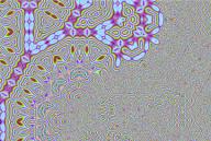
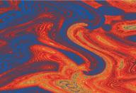
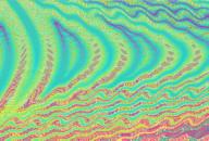
Interference
can create many interesting results that bear stylistic resonance to many
natural phenomena and artistic compositions.
As each point on the plane has a unique coordinate (x,y) a color can be
assigned to it based on some function f(x,y).
For example
Color
= x+y
Would
plot a pixel at (3,4) of "color 7".
In
RGB images there are of course three components of color per pixel (RGB), and
it is feasible to determine each one's value through a different equation. For the purposes of this study however it
was decided that a color palette would be determined first, then a single
equation could select the color index.
The
use of a color palette as opposed to separately treating RGB values is a matter
of taste and scope. From an artistic
view, in my experience the use of a predetermined palette (whether discrete or
function-based) in generative art can produce results with more sensorally
pleasing results. This knowledge was
important because the goal was to generate a system capable of generating
pleasing imagery.
I
think of watching the reflection of a sunset in a gently wavy pond. If you watch a certain point, at regular
phases of the waves' collective interference you see red, at others
yellow. Their interference is an equation
which points to a set of colors - the sky.
III. Software design
For
the framework of data generation, a model was invented. This model was designed as a hypothetical
method for generating images that might bear resemblance to natural forms.
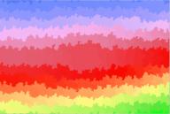
Color->Population->Displacement
As
described above, the Population part of the model used interference techniques
to create visual information. The color
palette generation method was developed using oscillators to continue the audio
synth analogy.
To
maintain smooth continuity and following the concept of interference and
natural phenomena, periodic functions were used to define a palette of RGB
values. This method allows for a great
variety of results, where the palette can have many interesting fluctuations
and harmonies.
PaletteR[index]
= cos(index / a1 + c1) * b1
PaletteG[index]
= cos(index / a2 + c2) * b2
PaletteB[index]
= cos(index / a3 + c3) * b3
(a,b
and c scaled sensibly)
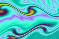
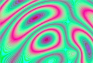
After
the colors have been defined, and the interference has populated the image, a
displacement occurs to further add variety and compositional possibilities. The method of displacement was an inverse
mapping based on vectors. For each
point in the image, its new value would be defined by the pixel pointed to by a
vector. This vector is defined by a
function. So for example, a
displacement vector could tell a point to get its new value by rotating 30
degrees around the center of the image.
If
these displacement vectors indicate a point off the image coordinates, the
point is reflected back into the image along the axis of the border. This reflection again adds visual variety in
the form of symmetry, and rhythm. Both
of these things are very common elements in both nature as well as art, and
their inclusion in a visual information synthesizer is welcome. Further, when this technique is iterated,
another great feature of visual synthesis is introduced - self-similarity.
So
for each of the three phases: Color, Population and Displacement, a function is
defined which takes few arguments, but gives a large range of possible visual
results. The arguments were set to be
both controlled through a GUI, and by random population for quick exploration
of results. The image's unique
identifier is then encoded in a short genotype, visible below the image screen.
After development, testing and refinement a system was settled upon which was able to create a large variety of images and quantify their creation. The software is code named MOTH and is available at the website listed above.
IV. Experiment
While
the major portion of this project was the development of a software environment
for image synthesis, we also hoped to find some trends in generative image
appeal. This is not a hard scientific
study. The goal is more for us as artists to gain some insight into what makes
images appealing, and what does not.
Any
questions involving art and "appeal" will ultimately boil down to
taste. However it is the contention of
this paper that given multiple samples of individual tastes it is possible to
discern trends reflecting general image appeal.
For
this reason it was decided to generate a sequence of images and quantify their
visual appeal by group viewings. The
group members would then rate each image.
The images synthesized were to exploit features, which could reveal
information about key elements of why people might like them. For example, image number 24 was simply a
hue-rotated version of image 22. Image
31 was designed to be confusing and would be hypothesized to score poorly. The ones I liked best were chosen as
candidates for high scores.
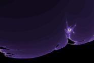
There
were also control images planted in the sequence. Two abstract photographs were placed as grounding elements,
hoping to receive reviews of indifference.
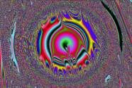
There were two fractals inserted in the sequence as well. Generated by another piece of software,
these fractals were placed to break up the sequence with completely different
forms, thereby keeping the discerning eye fresh.
Again,
since this is an artistic venture more than a scientific one, we aren't
concerned with the details and implications of image sequencing. Similarly,
psychological questions and statistical details are not important. We simply
hope to notice trends which will aid us in the development of generative
art.
The
people who would view these images were to rate each one on a scale of one to
five. One correlates to "highly
unappealing", two to "unappealing", three means indifferent,
four means "appealing”, and five means "Highly appealing". This very rough rating system is helpful
because instead of people getting caught up in whether an image is a
"6" or a "7", for example, they simply react to it and
chose the closest rating.
The
participants were asked to view images for purely their visual appeal. After displaying each image in sequence
(sequence is visible at the end of this paper) and obtaining ratings from the
participants, the mean is found to arrive at an approximation of the general
appeal of each image. As of now,
approximately 50 people have added data through their ratings. The data obtained in the experiment is shown
here:
|
|
1 |
2 |
3 |
4 |
5 |
6 |
7 |
8 |
9 |
10 |
11 |
12 |
13 |
14 |
15 |
Total |
Mean |
|
|
30 |
5 |
5 |
5 |
4 |
5 |
4 |
4 |
2 |
4 |
5 |
5 |
4 |
2 |
5 |
5 |
64 |
4.27 |
|
|
35 |
4 |
5 |
3 |
4 |
5 |
4 |
5 |
5 |
5 |
4 |
2 |
4 |
3 |
4 |
4 |
61 |
4.07 |
|
|
6 |
5 |
4 |
4 |
2 |
4 |
5 |
2 |
3 |
4 |
4 |
5 |
4 |
3 |
5 |
5 |
59 |
3.93 |
|
|
7 |
4 |
5 |
3 |
4 |
4 |
5 |
4 |
3 |
5 |
4 |
4 |
4 |
4 |
3 |
3 |
59 |
3.93 |
|
|
9 |
5 |
5 |
4 |
5 |
4 |
4 |
3 |
2 |
2 |
5 |
4 |
5 |
2 |
5 |
4 |
59 |
3.93 |
|
|
1 |
5 |
3 |
2 |
1 |
4 |
4 |
5 |
4 |
3 |
5 |
4 |
4 |
3 |
5 |
4 |
56 |
3.73 |
|
|
11 |
4 |
5 |
3 |
5 |
4 |
3 |
2 |
3 |
4 |
5 |
3 |
3 |
2 |
5 |
5 |
56 |
3.73 |
|
|
16 |
4 |
4 |
3 |
4 |
5 |
4 |
3 |
3 |
2 |
5 |
4 |
3 |
2 |
4 |
4 |
54 |
3.60 |
|
|
17 |
5 |
2 |
3 |
4 |
4 |
5 |
3 |
4 |
3 |
4 |
5 |
3 |
3 |
3 |
3 |
54 |
3.60 |
|
|
20 |
3 |
3 |
3 |
4 |
4 |
3 |
5 |
4 |
3 |
4 |
2 |
5 |
3 |
4 |
4 |
54 |
3.60 |
|
|
5 |
5 |
5 |
2 |
4 |
1 |
4 |
3 |
4 |
3 |
5 |
4 |
5 |
3 |
1 |
4 |
53 |
3.53 |
|
|
19 |
2 |
3 |
4 |
3 |
2 |
3 |
5 |
3 |
4 |
5 |
4 |
5 |
2 |
3 |
4 |
52 |
3.47 |
|
|
21 |
3 |
4 |
4 |
1 |
3 |
5 |
4 |
3 |
4 |
4 |
3 |
5 |
4 |
2 |
3 |
52 |
3.47 |
|
|
25 |
2 |
4 |
4 |
3 |
1 |
3 |
5 |
4 |
4 |
3 |
3 |
4 |
4 |
4 |
4 |
52 |
3.47 |
|
|
37 |
3 |
5 |
4 |
3 |
4 |
3 |
4 |
2 |
4 |
3 |
3 |
4 |
3 |
3 |
4 |
52 |
3.47 |
|
|
28 |
4 |
2 |
4 |
2 |
4 |
4 |
3 |
3 |
3 |
3 |
4 |
5 |
2 |
3 |
5 |
51 |
3.40 |
|
|
2 |
3 |
3 |
3 |
4 |
4 |
4 |
5 |
3 |
3 |
4 |
3 |
2 |
4 |
2 |
3 |
50 |
3.33 |
|
|
8 |
5 |
3 |
2 |
4 |
2 |
4 |
2 |
4 |
3 |
4 |
3 |
4 |
2 |
4 |
4 |
50 |
3.33 |
|
|
13 |
4 |
5 |
3 |
4 |
2 |
4 |
3 |
3 |
1 |
4 |
2 |
4 |
3 |
4 |
4 |
50 |
3.33 |
|
|
29 |
4 |
4 |
3 |
3 |
3 |
4 |
3 |
4 |
3 |
4 |
3 |
4 |
2 |
3 |
3 |
50 |
3.33 |
|
|
4 |
3 |
5 |
2 |
4 |
3 |
4 |
2 |
4 |
2 |
4 |
3 |
2 |
2 |
5 |
4 |
49 |
3.27 |
|
|
27 |
4 |
3 |
3 |
4 |
3 |
3 |
3 |
3 |
2 |
4 |
4 |
4 |
2 |
4 |
3 |
49 |
3.27 |
|
|
38 |
4 |
4 |
2 |
4 |
4 |
2 |
2 |
4 |
4 |
4 |
3 |
3 |
3 |
3 |
3 |
49 |
3.27 |
|
|
15 |
2 |
2 |
3 |
3 |
3 |
3 |
4 |
2 |
3 |
5 |
3 |
4 |
2 |
4 |
3 |
46 |
3.07 |
|
|
33 |
4 |
2 |
3 |
2 |
4 |
2 |
3 |
4 |
4 |
3 |
1 |
3 |
3 |
4 |
4 |
46 |
3.07 |
|
|
3 |
4 |
2 |
2 |
5 |
2 |
4 |
1 |
2 |
4 |
3 |
2 |
3 |
4 |
4 |
3 |
45 |
3.00 |
|
|
32 |
1 |
5 |
3 |
2 |
3 |
3 |
3 |
4 |
2 |
4 |
3 |
5 |
2 |
3 |
2 |
45 |
3.00 |
|
|
12 |
5 |
3 |
2 |
2 |
4 |
3 |
1 |
4 |
3 |
4 |
2 |
3 |
2 |
3 |
3 |
44 |
2.93 |
|
|
14 |
2 |
4 |
4 |
4 |
2 |
4 |
4 |
3 |
1 |
2 |
2 |
3 |
2 |
3 |
4 |
44 |
2.93 |
|
|
23 |
1 |
5 |
2 |
4 |
1 |
2 |
4 |
2 |
3 |
4 |
2 |
4 |
2 |
4 |
3 |
43 |
2.87 |
|
|
40 |
3 |
5 |
2 |
1 |
2 |
2 |
3 |
4 |
3 |
3 |
4 |
3 |
2 |
3 |
2 |
42 |
2.80 |
|
|
18 |
5 |
2 |
2 |
2 |
3 |
2 |
2 |
2 |
5 |
2 |
1 |
4 |
2 |
2 |
5 |
41 |
2.73 |
|
|
26 |
3 |
2 |
4 |
1 |
4 |
3 |
4 |
2 |
2 |
1 |
1 |
2 |
2 |
3 |
5 |
39 |
2.60 |
|
|
39 |
2 |
2 |
4 |
3 |
2 |
2 |
2 |
4 |
5 |
1 |
2 |
2 |
2 |
1 |
4 |
38 |
2.53 |
|
|
10 |
2 |
2 |
1 |
1 |
2 |
3 |
3 |
3 |
4 |
2 |
2 |
4 |
3 |
2 |
2 |
36 |
2.40 |
|
|
34 |
3 |
2 |
4 |
1 |
1 |
2 |
3 |
3 |
1 |
4 |
1 |
2 |
2 |
3 |
4 |
36 |
2.40 |
|
|
36 |
2 |
4 |
3 |
1 |
1 |
2 |
2 |
3 |
5 |
3 |
1 |
2 |
2 |
2 |
3 |
36 |
2.40 |
|
|
22 |
2 |
4 |
1 |
1 |
1 |
3 |
3 |
2 |
2 |
2 |
2 |
3 |
3 |
4 |
2 |
35 |
2.33 |
|
|
24 |
2 |
5 |
1 |
1 |
1 |
2 |
3 |
2 |
3 |
2 |
2 |
2 |
3 |
3 |
2 |
34 |
2.27 |
|
|
31 |
1 |
2 |
1 |
1 |
1 |
2 |
2 |
2 |
1 |
2 |
2 |
3 |
2 |
2 |
3 |
27 |
1.80 |
|
|
|
|
|
|
|
|
|
|
|
|
|
|
|
|
|
|
|
|
|
Each
row represents an image, numbered from 1-40.
Each column represents an individual reviewer.
This
data could be analyzed many different complex ways. For this project however, we are leaning further into the
philosophy of art than into numerical analysis. A generative artist should first and foremost look at the average
ratings along with the sequence. They
can then view trends that correspond to their own questions about color and
composition. So for now, our focus is
maintained on broad trends which ca be further refined in the future.
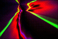
V. Results and Conclusion
One
trend is immediately noticeable: the lower rated images tend to have higher
frequencies involved in their generation.
High frequencies in the palette generation stage of synthesis such as
image 31 yielded images that scored lower.
Conversely, palettes with lower frequencies such as 30, 35 and 9 tended
to score better.
Also
regarding color, palettes with good complimentary balance scored better than
those without. For example, image 7, 20
and others display this property, while 36 does not.
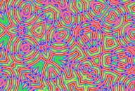
Similarly,
the factors of the array Population (interference) introduced trends related to
frequency. The higher frequency
interference patterns tended to score much lower than the lower frequencies. For example, images at the lowest 10 ranks
all have higher frequencies of interference patterns than most of the higher
scoring images.
The
lower appeal of high-frequency (or "busy") images makes sense in
different ways. First, as an analogy to
audio: high frequencies that are out of phase and non-harmonic sound
unappealing. Image 31 was designed with
these exact characteristics in mind, hypothesized to score poorly and it did. Second, as the image detail approaches a
sub-resolution level, the bitmap loses its ability to display them in a
meaningful fashion. For example, image
26 shows a very detailed and complex interference pattern. However, the resolution of the image limits
the detail, and the image becomes chaotic and unappealing.
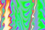
Displacement
was similar to the others in its frequency-affected trends. The high frequency changes in displacement
images like 24, and 26 scored lower than slower-changing displacements like 35
and 16.
It
seems that as a general rule, *the frequencies that seem to provide the best
results are those which cycle only a few times over their input range*. If the parameter goes through a single cycle
over its range, then it exploits all of its possible values, but no more. This slower changing of parameters often
correlates to an image with descriptors such as "flowing",
"smooth", "painterly", or "balanced". But the images featuring prominent high
frequency attributes received comments such as "messy" and
"busy". The ratings back up
these adjectives as quantification of such concepts.
There
are images in the sequence that seem to defy the trends I have mentioned. For example, image 6 was predicted to score
poorly but it finished ranked third. It
features what I considered ugly colors, and a confusing and busy
composition.
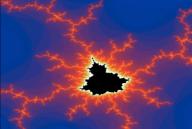
Interestingly,
the highest scoring image was one of the control images. It was image 30, a mutation of Mandelbrot
Set (escape velocity shading) that is actually my favorite of all the images as
well. While inserted as a control, and
developed under a different project (MAX/MSP fractal explorer), its appeal is
still relevant in the sequence. It
shows what is in my opinion something beautiful. With an average rating greater than "Appealing", the
data seems to support that opinion.
But
it is just numbers. It’s a set of rules
simple enough to code on a single screen.
Yet somehow, after the program iterates enough times, it creates beauty. A flower, a gently cloudy sky over a fiery
sunset, trees in autumn, the ocean, and many of the most stereotypical
"beautiful" things imaginable are being driven by complex
systems. While we can't replicate them,
we can synthesize things that use models of similar forces in the hope of
generating appealing images.
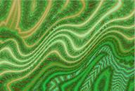
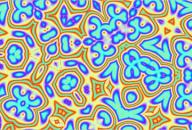
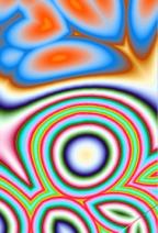
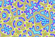
So our project was a success. The goal of creating an interactive visual synthesizer was achieved. Also, we observed at least two useful general trends in the data that will aid in generative art design. The software is fun to use, and is a tool to create interesting pieces of abstract generative art.
VI. Image Sequence
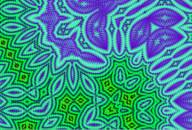
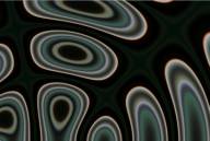
1 2 3
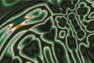
4 5 6
7 8 9
10 11 12
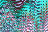
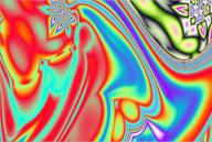
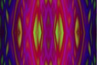
13 14 15
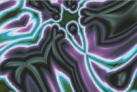
16 17 18
19 20 21
22 23 24
25 26 27
28 29 30

31 32 33

34 35 36
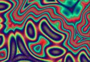
37 38 39
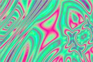
40